About Flair
Flair Airlines is a Canadian low-cost flying company, founded in 2005 as Flair Air. Throughout time, the airline have had 2 brand makeovers, 2017 introduce an acid red and dusty blue and in 2019 change to black and bright green with the slogan “Plane and Simple”
Problem
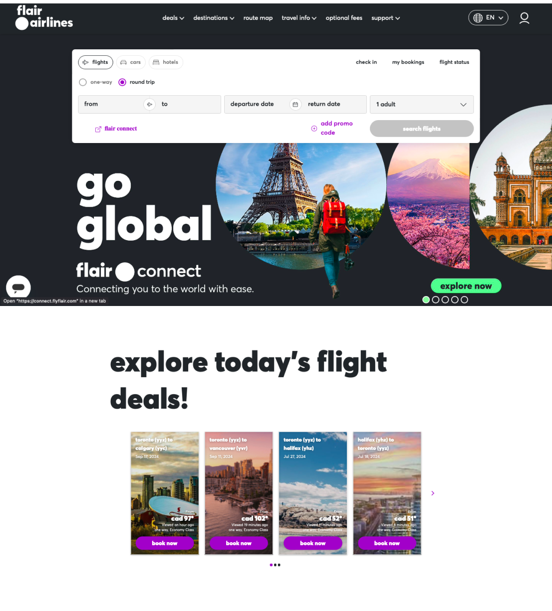
One of the main issues with the airline is that there is no consistency between pages, a huge amount of colors, and dark accents. There is a lot of information at once and a lack of direction or obvious patterns. Users often feel misdirected and confused.
Solution
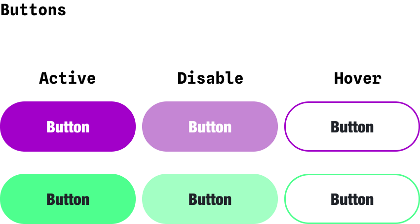
Just as the slogan “Plane and Simple”, sometimes less is better, avoid crowded elements and overwhelm information. Less use of dark colors and more white space with a single color accent at once


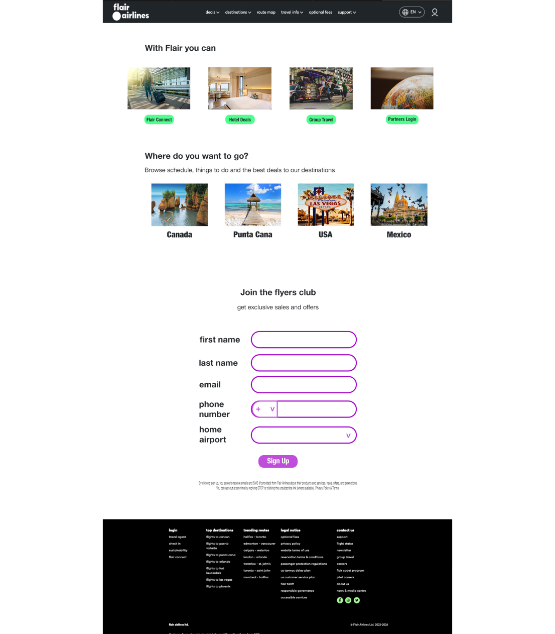
Desktop
Keep the same navigation menu. Eliminate the dark background.
Separate the hero banner from the search form
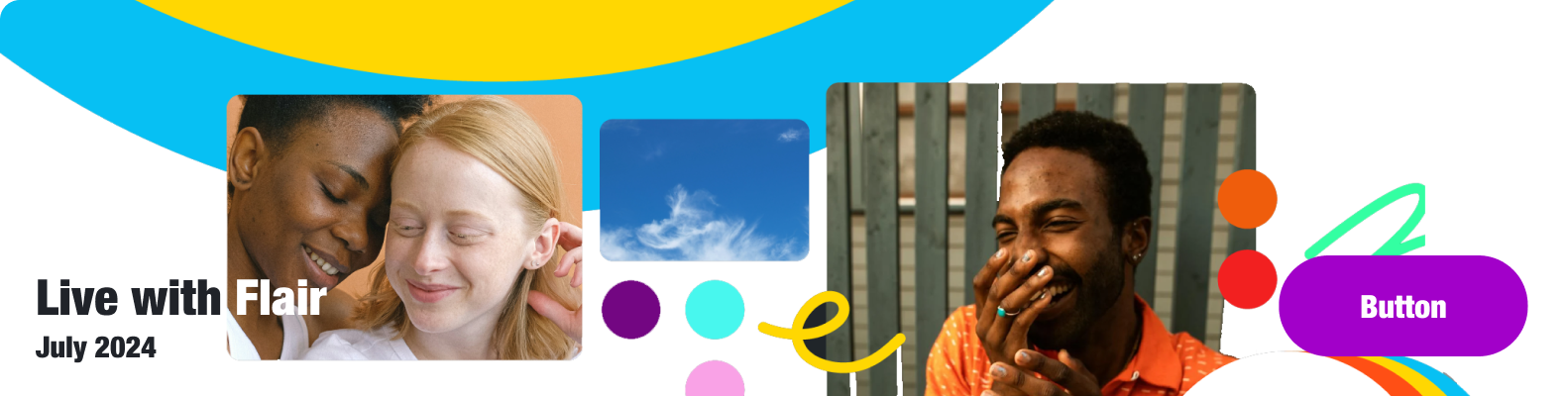
Simplify the hero banner with white space and simple information. Include campaign copy and promotional dates.
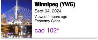
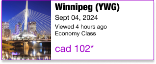
Create bigger cards to avoid crowded information and use a "Top 3 Deals" format.
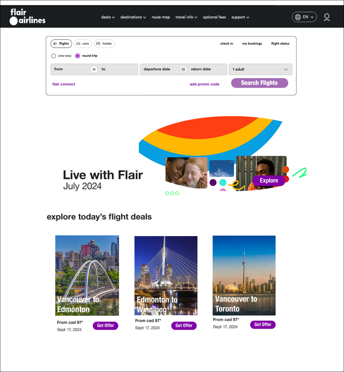
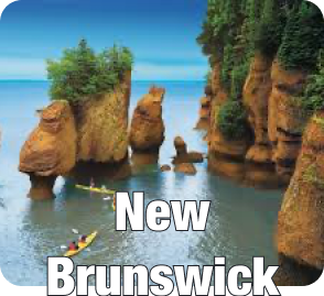
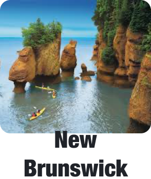
Separate the image from the CAT to let the image speak for itself and avoid a crowded sensation.
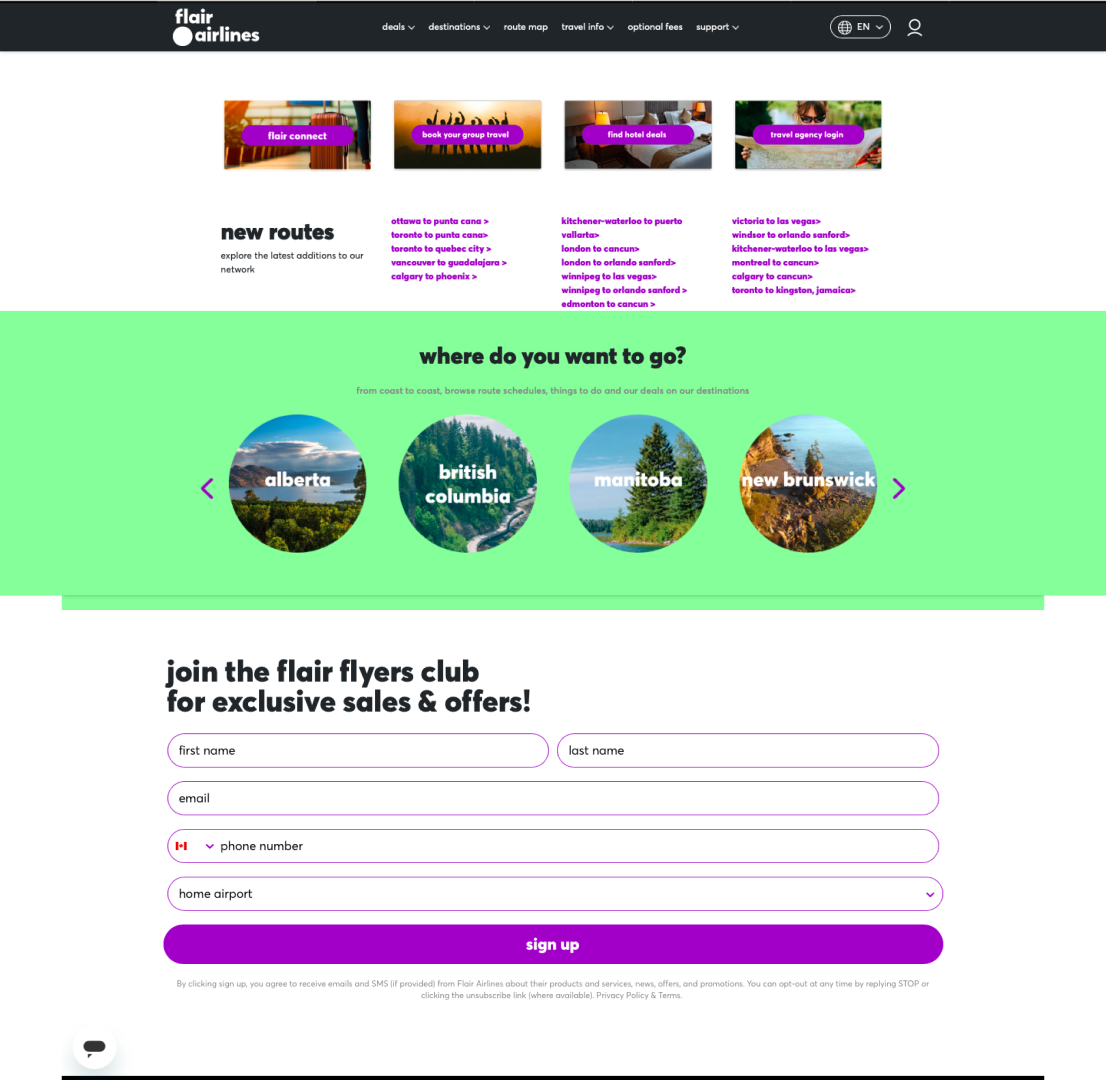
Combine the sections "New Routes" and "Where to Go" into one. Assign every route to a category, in this case, by country. Delete link access and redirect them to a common category. Delete the background color to keep a neutral white space.
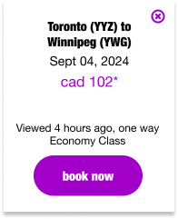
Add padding to the form section for better readability
Do you want to know more?
Let's get a virtual coffee to talk about it!
check out the full study here
Download Flair Study