in-Haus is an AI-powered mobile app that simplifies household management by organizing tasks among all members, sharing all family events, getting access to recipes and planning your meals all while collaborating and earning toward group or family rewards.
in-Haus
For this team project, I served as both Project Manager and UX/UI Designer, collaborating closely with two other designers and four developers. Over a 12-week timeline, we structured In-Haus into the following phases:
- Ideation and Planning
- Market and User Research
- Wireframing
- Design and Prototyping
- Development and Deployment
Project Manager
Defining Scope: orked with stakeholders to define project objectives, deliverables, and deadlines, ensuring we stayed on track.
Milestone Setting: Divided the project into clear, achievable milestones across the 12-week timeline, from ideation to deployment.
Timeline Adjustments: Adjusted timelines and managed dependencies as project requirements evolved, ensuring efficient progress across creative and technical workstreams, always making sure to identify prioties
Process Documentation: Maintained detailed records of project decisions, changes, and workflows to support future reference and smooth handoffs.
UX-UI Designer
User Research: Conducted interviews with diverse audiences to identify their needs and preferences, evaluating how our project could best meet their expectations.
Data Analysis: Analyzed user research findings to create Personas, User Flows, and an optimal User Journey.
Color Palette: Selected an effective color palette based on research, recognizing that color serves as the “voice” of a brand and can significantly shape user perception.
Wireframing: Designed wireframes and prototypes for key features, including the Meal Planner and Onboarding process, to establish an intuitive and appealing user experience.
The Project
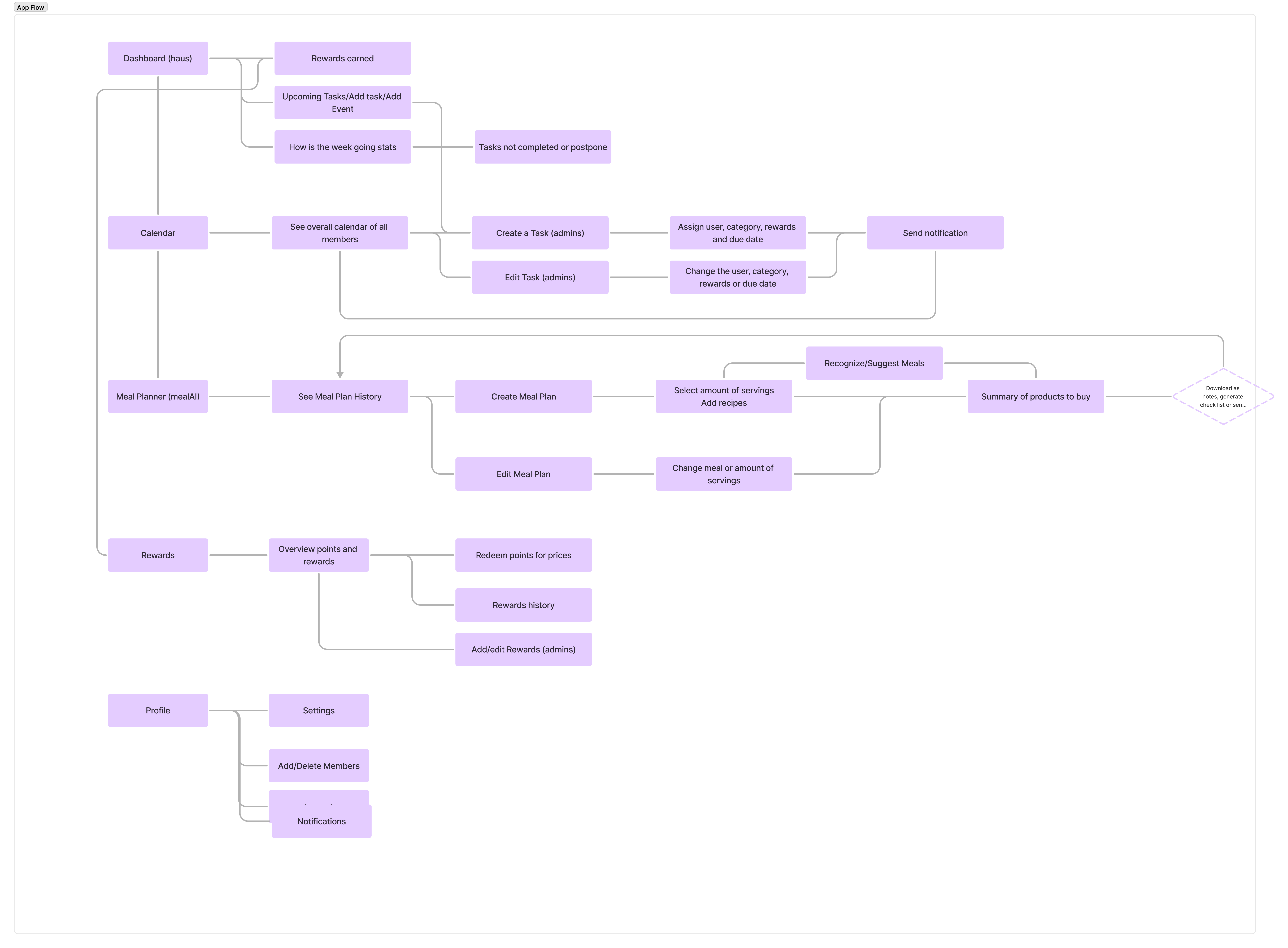
User Flow
The following User Flow was created in order to exemplify how our audience will interact with the app. After interviewing a variety of possible users, this was the result of their needs.
User flows are crucial because they visually map out the journey a user takes to accomplish a specific task within an app. By understanding and addressing the needs identified during user interviews, we can design intuitive experiences that align with user expectations. This process helps ensure the app's features are logical, user-friendly, and goal-oriented. Moreover, user flows allow teams to identify potential pain points, improve efficiency in navigation, and create a seamless path that keeps users engaged and satisfied.
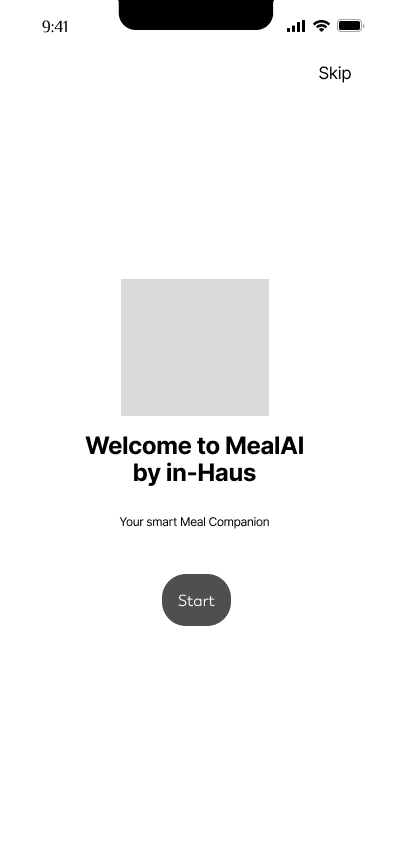
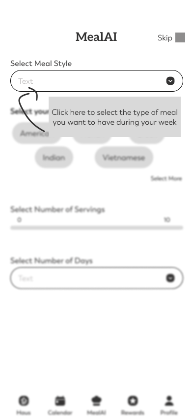
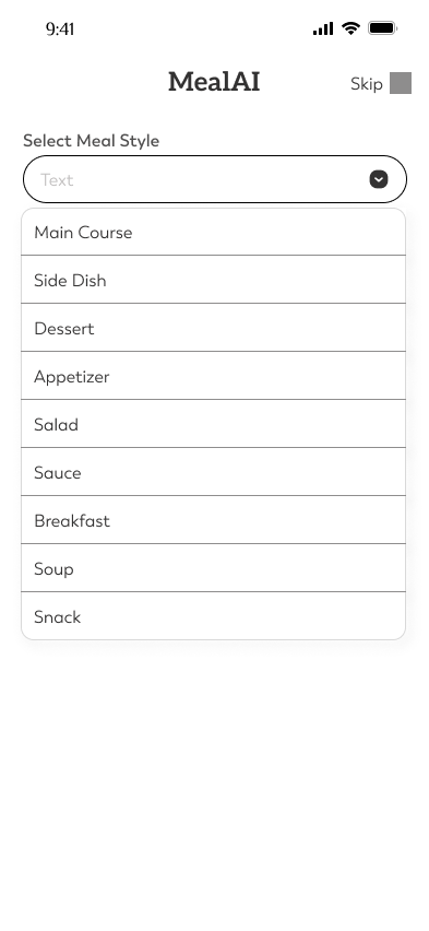
Wireframe
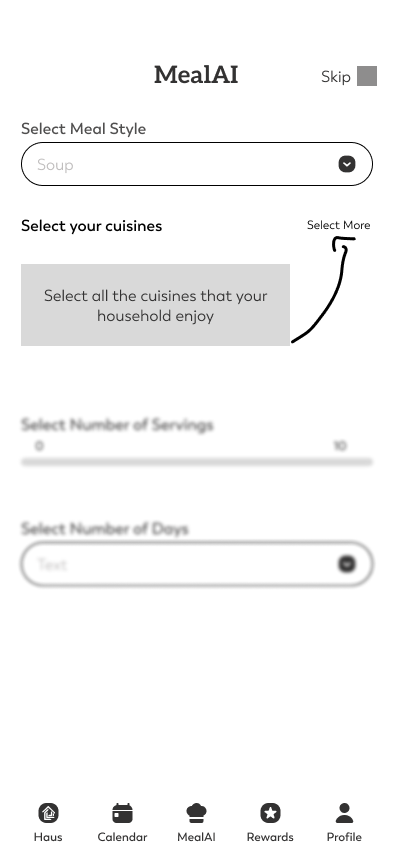
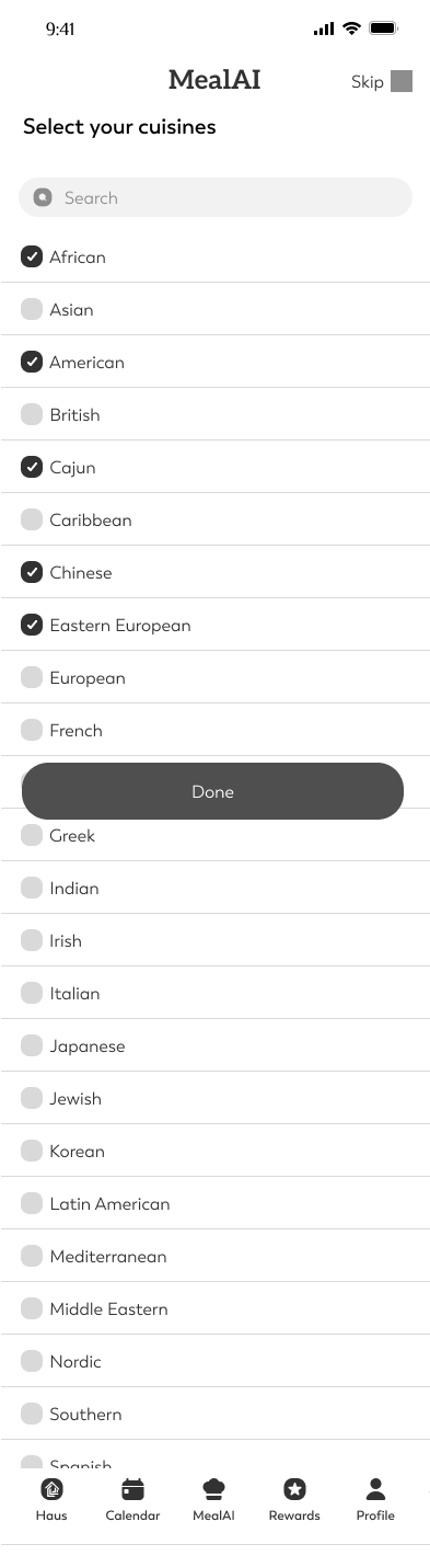
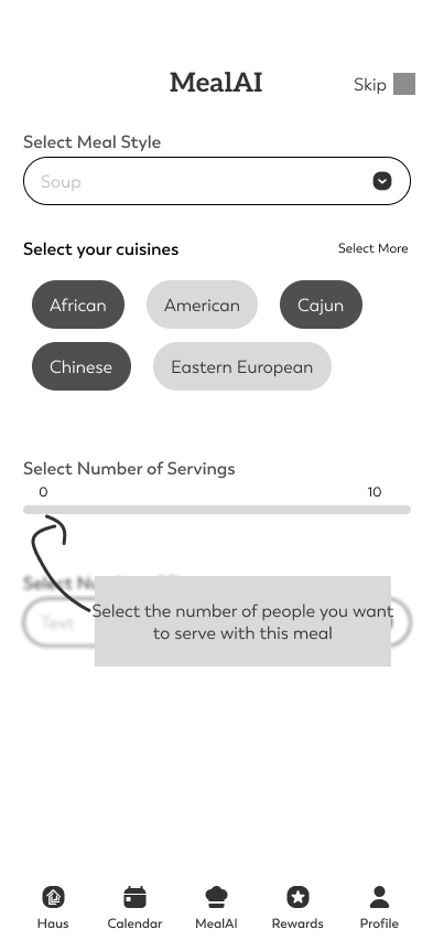
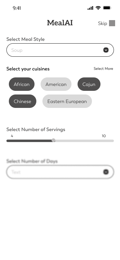
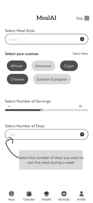
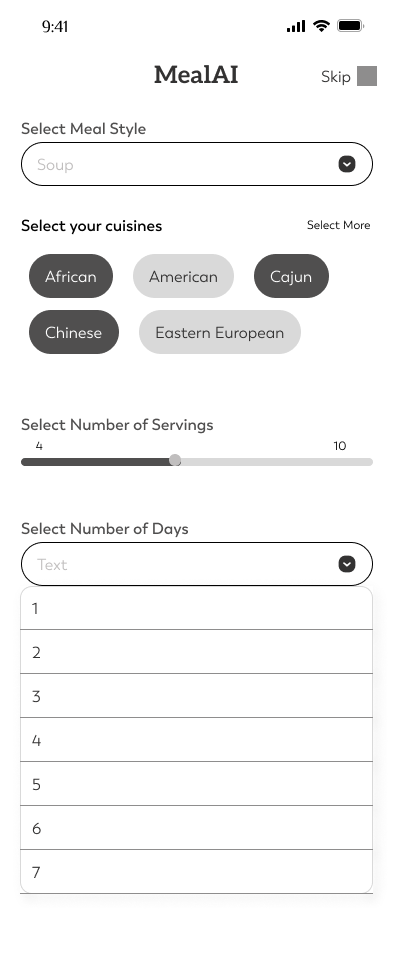
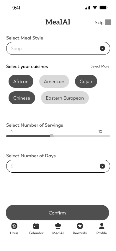
This low-fidelity wireframe is the first iteration of the MealAI feature. This feature uses AI to assist with meal planning. The In-Haus family will have access to recipes provided by an API and can select ingredients to add to a shared shopping list, which can be accessed by any household member.
Color Palette
The primary color palette is designed to create a balanced and engaging user experience, promoting trust and harmony with fun accents and minimal shades that blend seamlessly with real images.
- Blue (#476BFB): A calm color often associated with reliability and relaxation.
- Purples (#A82487, #7566CA): Colors that represent creativity and innovation.
- Orange (#FF5A5F): A vibrant and energetic color.
